Using Color to Reinforce Your Real Estate Brand

Color psychology plays an essential role in marketing. The colors you use on your website, business cards, logo, and listings have the potential to affect your customers’ actions. Here are some tips on how you can use color psychology to your advantage.

-
Know your brand personality
Jennifer Aaker, a psychologist and professor, wrote a paper titled “Dimensions of Brand Personality” discussing the five dimensions that determine brand personality. These include:- Sincerity
- Excitement
- Competence
- Sophistication
- Ruggedness
A brand has one dominant dimension, though they can also be a cross between two traits. Certain colors align with specific traits, such as red for excitement and purple for sophistication.
However, academic studies on color and branding suggest that it’s far more important to use color to project the personality you want instead of aligning the brand with stereotypical colors.
-
Think context
The color green is generally perceived to have a calming effect. However, this interpretation of the color is too broad and lacks context. Green has been used for environmentally-conscious brands like Seventh Generation, as well as pharmaceuticals companies like Merck, which is associated with healing and wellness.Brown, for example, can be used to convey a rugged and earthy appeal, as with Saddleback Leather Co. However, when used in a different context, brown creates feelings of warmth and comfort – it is the dominant hue for family celebrations like Thanksgiving, and it is widely used by chocolate brands like Hershey’s and M&M’s.
-
Choose colors that differentiate your brand
Studies have shown that consumers prefer easily recognizable name brands, making color an important component when forging a brand’s identity. Some experts go as far as to say that marketers should use color to differentiate their brand from major competitors.
Your real estate brand’s color scheme must represent your target audience’s desires and emotional associations, as well as the value proposition or marketing promise that your brand offers in response to those desires.
Choosing a color that differentiates your brand should be based on several criteria, some of which include:
-
Your target audience – Who are they, what do they care about, and what mood should they be in to be able to engage with your brand? Consumers are affected by colors in different ways, and cultural trends affecting this are constantly in transition. Which color conveys the meaning of your brand’s value and unique selling proposition to the audience?
-
Brand archetype – Archetypes originate from the work of psychiatrist Carl Jung, who delved into the role myths and symbols played in human thinking. Although each individual is unique, people have shared traits that enable us to classify and make sense of ourselves.
The same goes for brands – consumers personify brands, giving them meaning and establishing relationships with them based on what they stand for, and what kind of emotions they inspire.
Your brand’s personality affects the way consumers connect to it, as well as influences the meaning they assign to it. Your brand’s personality can be classified as an archetype.
Once you’ve determined the archetype that corresponds with your brand, you’ll have to decide which color best represents its attributes.
-
Culture – Colors mean different things to individuals in different parts of the world. In the United States, white stands for purity. But in Asian countries like China and Korea, it is the color of death and mourning.
Color meanings and perceptions also vary with age, gender, race social class, and religion. The psychographics and demographics in the culture of the market that your brand serves should be a major consideration when selecting a color.
-
-
Pick an appropriate color
When choosing the right color, research suggests that predicting consumers’ reaction to the appropriateness of the color is more important than the color itself. A study has also found that the relationship between color and brands is anchored on consumers’ perception of how appropriate the color is for the product being sold.Consumers know intuitively whether a brand and a color connect. If they don’t connect, consumers get turned off. This means that the color used to represent the brand should be a good fit for the product or service that is being sold.
However, experts warn against simply using popular colors that customers might like. Instead, they encourage brands to focus on authenticity. For example, when Volkswagen introduced a neon green car to the market, buyers were immediately receptive. Not only was the color unique, it also tied back to the ideas that the brand was trying to communicate – renewal, rebirth, and bringing back an old iconic brand while at the same time giving it a modern twist.
The perceived appropriateness of color use can bring immediate and inherent value to the brand. For example, American Airlines incorporates the colors of the flag in its logo, which echoes its status as a major airline in the United States. Apple uses white, silver, and black – a color scheme that conveys futurism and elegance, and which ties back to the brand’s messaging and positioning.
Choosing a color for your brand is more than just a creative decision. It’s a marketing move that can differentiate you from competitors, as well as make clients more responsive to your brand.
With these tips in mind, choosing the right color scheme should be a breeze. Let Agent Image assist you as you build your real estate brand. We have an entire team of design professionals ready to give you the in-depth consultation you need for your next successful branding project.
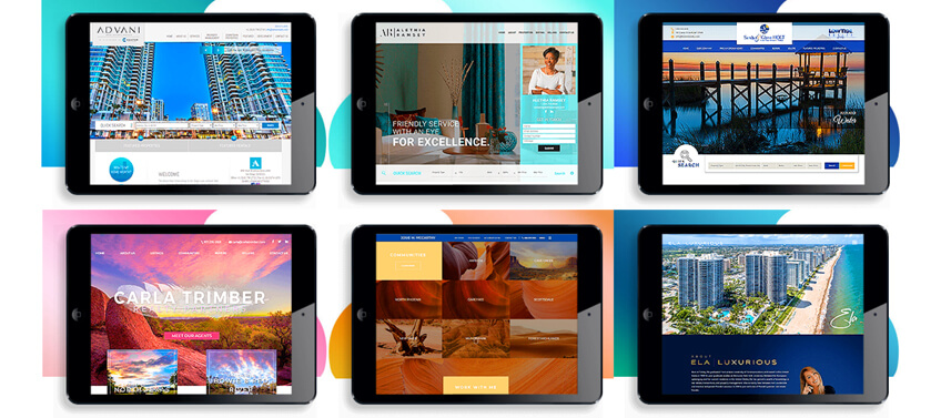
Here are just few examples of how color can spell a dramatic difference for your real estate website:

The post Using Color to Reinforce Your Real Estate Brand appeared first on Best Real Estate Websites for Agents and Brokers.
from RSSMix.com Mix ID 8230708 https://ift.tt/2x6Box2
via IFTTT
Comments
Post a Comment